What Are the “Visions of Lorelei”?

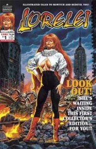
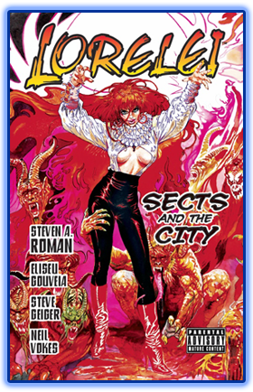
In 2011, The ’Warp introduced dark-urban-fantasy readers to my novel series The Saga of Pandora Zwieback through “The 13 Days of Pan-demonium”—a celebration of the publication of Blood Feud: The Saga of Pandora Zwieback, Book 1. Well, I figured, why not do the same thing for StarWarp Concepts’ first horror heroine, the succubus Lorelei, and her brand-new Mature Readers graphic novel Lorelei: Sects and the City, which is on sale right now?

Thus, Visions of Lorelei, a 13-part artistic event that will run here on the SWC blog August 1–13. This event, however, is a little different from when I hired artists for the “13 Days of Pan-demonium” promotion, because I already have a collection of Lorelei drawings.

During my more fannish days I used to do what a lot of convention-goers do, if they’ve got the money: pay your favorite artists to do sketches of your favorite comic book characters. In my case, I’d ask them to draw Lorelei. This lasted between 1989—after I’d introduced her in a minicomic that I’d written and drawn—and 1992, when I started making plans for launching StarWarp Concepts and making Lorelei a real comic book, and needed the money to get things done.

Who’s in the lineup? For starters, we’ve got Louis Small Jr. (Vampirella); Uriel Caton (JSA Annual and Pandora’s co-creator); Dave Simons (Ghost Rider); Mark Beachum (Peter Parker: The Spectacular Spider-Man); Frank Thorne (Red Sonja); Tim Vigil (Faust), and Gray Morrow (Zatanna). And then there are the surprise guests you probably would have never expected to see drawing my soul-stealing femme fatale!

Some are rough pencils, some are fully inked; some are in color, some in black and white. But all of them are artworks I’m proud to have in my collection, and I hope you’ll enjoy seeing them.

Posted in 13 Days of Pan-demonium, Lorelei, Visions of Lorelei | Tagged , | Comments Off on What Are the “Visions of Lorelei”?

Lorelei: Sects and the City Now On Sale

Let the word go forth: Lorelei: Sects and the City is now available for your reading pleasure! This 152-page graphic novel features a script by yours truly, and art by Eliseu Gouveia (the fantastic artist of our illustrated classics Carmilla and A Princess of Mars, and the comic The Saga of Pandora Zwieback #0), Steve Geiger (Web of Spider-Man, The Incredible Hulk), and Neil Vokes (Flesh and Blood, Fright Night).

Lorelei Munro is a succubus attempting to stop Elder Gods from destroying the world, but that proves difficult to accomplish when she becomes the target of fanatical cultists who worship those very gods. If you’re a fan of old-school horror comics like Vampirella, Creepy, Tales of the Zombie, and Werewolf by Night, then this is the book for you!

Speaking of fan appeal, this tome also showcases work from three of horror comics’ greatest artists: Ernie Colon (The Grim Ghost, Inner Sanctum), Tom Sutton (Werewolf by Night, Ghost Rider), and cover painter Esteban Maroto (Vampirella, Zatanna: Come Together). Plus there are pin-ups by Louis Small Jr. (Vampirella, Supergirl). Now that’s some package!

Due to some adult themes in the book (sex, violence, nudity, and an armory’s worth of F-bombs), we’ve designated it a Mature Readers title (for readers 18 years and older) and placed a parental advisory on the front cover. If you’re a teenaged fan of my Pandora Zwieback novels (and thanks for being one), this really isn’t a graphic novel for you—but your dad might like it!  ;-D  (Cue the legions of female readers now screaming “Ewww!”) But don’t worry, Pan-atics, you’ll get your own comic adventure next year, in The Saga of Pandora Zwieback Annual #1.

For more information on the book, visit the Lorelei: Sects and the City product page. There you’ll find where to order it from, and you can also check out some sample pages. Get your copy today!

Posted in Lorelei | Tagged | Comments Off on Lorelei: Sects and the City Now On Sale

Lori, Jim Warren, and the Ackermonster

Yesterday I was discussing reactions I’ve received over the years from some comic book professionals I’ve introduced to my succubus character, Lorelei—the star of SWC’s new Mature Readers graphic novel, Lorelei: Sects and the City. When I launched her initial series in the 1990s, I got responses from mainstream comics legend John (X-Men) Byrne and self-publishing’s biggest advocate, Dave (Cerebus) Sim. Unfortunately, I had to cancel the bestselling series due to overwhelming production costs. Still, I wasn’t about to give up that easily…

In 2002 I decided to revive Lori in a new series, this time designed to emulate the black and white horror magazines I’d read and enjoyed in the ’70s and early ’80s—specifically, Warren Publishing’s Vampirella, Creepy, and Eerie. Each issue would feature a chapter of a new Lori serial, “The Architects of Fear” (now known in graphic novel form as Sects and the City), followed by short backup stories from writers and artist I’d approached, plus reprints of the first Lorelei series. And when the first issue debuted, I knew exactly who I wanted to send copies to…


James Warren was the horror comics publisher of the 1960s and ’70s, his lineup of magazines featuring stories written for adult audiences and artwork that was the envy of the industry. What Stan Lee was to superheroes, Warren was to horror—an outspoken front man who was a touch flamboyant (a yellow, WWI biplane replica—on his front lawn?!), opinionated, and an editorial juggernaut. When he saw how the Comics Code Authority—mainstream comics’ alleged guardians of decency—ruled over the four-color books, he decided to publish his comics as black and white magazines because those were outside the CCA’s jurisdiction. His approach was so groundbreaking that both Marvel and DC tried to emulate his game plan with b&w mags of their own, though with far less success.

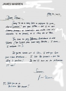
When Lorelei, Vol. 2 #1 hit comic shops, I immediately sent Warren a copy, hoping he’d like what he saw. And he did!

Dear Steven –
Sorry to be so very late in replying to your issue of “Lorelei” and your letter — but I do get literally hundreds of submissions each month — and it is impossible to be prompt, as I study all of them.
You sure do pay Warren Publishing a nice tribute (the contents page looks very familiar; I know—I designed it—).
If you’re coming out in July, I wish you good luck & good acceptance — I like the graphics — and the story is exciting! Be sure to send me an autographed 1st copy!
Sincerely,
Jim Warren
PS: Will you be in San Diego this summer?

Knowing that I’d made one of my idols happy with my efforts (accomplished with the help of artists Steve Geiger, Ernie Colon, David C. Matthews, and Grant Miehm, and designer Mike Rivilis) made me confident that this time Lori would be a success. I mean, I had Jim Warren’s blessing, and he’d always had a reputation for being a stickler for quality material, so I must be doing something right—right? And if Warren was pleased, what might his #1 creative partner think of Lori? I had to find out…

For generations of young horror and science fiction fans—including future author Stephen King and directors Steven Spielberg, John Landis, and Joe Dante—the gold standard of magazines was Warren Publishing’s Famous Monsters of Filmland, a b&w excursion into the past and present of genre movies, edited by science fiction fan/agent/collector extraordinaire, Forrest J Ackerman. Known to his worldwide fan base as Uncle Forry and the Ackermonster (who lived in “Hollyweird, Karloffornia”), Ackerman was the Willy Wonka of science fiction, fantasy, and horror, inviting kids of all ages to join in on the fun and be amazed at the wonders they’d find in every issue.

More important to me, though, was that this was the guy who created Vampirella, comics’ most popular half-naked, space-vampire monster fighter. A blend of pinup model Bettie Page (according to reports, a suggestion made by Warren, who’d published photos of her in After Hours, a 1950s Playboy wannabe), Jane Fonda’s kittenish on-screen portrayal of France’s science-fiction comic heroine Barbarella, and Florence Marly’s bloodsucking space vampiress from the low-budget 1966 film Queen of Blood (in which Ackerman appears as Basil Rathbone’s silent assistant), Vampirella was everything the Comics Code hated in a female character: violent (she drank blood), a monster (even her name flaunted what she was!), and—worst of all—unrepentantly sexy. Parading around in nothing but a tiny one-piece swimsuit and go-go boots, enticing men so she could drink their blood—what a hussy! But since Vampirella was the star of a black and white magazine, not a color comic book, there was nothing the CCA could do about it.

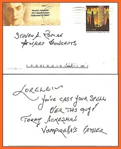
Since Vampirella was a major influence on the creation of Lorelei (with a little bit of Marvel’s succubus, Satana, the Devil’s Daughter, thrown in because I didn’t want a female vampire), of course I was going to send a copy of Lorelei #1 (2.0) to the Ackermonster! And a couple of months later, I found this in my mailbox:

I actually gave a little fanboy squeal when I saw it. The handwriting is a little shaky, because Forry had been in declining health for years, but still—Forrest J Ackerman! Giving Lori his okay! How cool is that?

Unfortunately (again!), this time Lori had an even shorter shelf life, because even with the acclaim I received sales of the two issues were practically nonexistent and I had to end the series right there. The comics market had changed drastically since I’d first suspended publication in the ’90s, and it was reflected in the major attitude shift in comic fans.


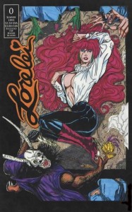
In 1993, Lori’s open blouse on the cover of the zero issue and a topless stripper on three interior pages were accepted as parts of a comic aimed squarely at an adult audience. In 2002, however, those same elements got me labeled a soft-core pornographer by politically correct comic book reviewers. Even worse, at conventions I would literally watch, stunned, as women snapped “That’s not for you!” at their men and yanked them away from my booth. At the 2002 Small Press Expo, I even had a woman throw a pamphlet on my table as she walked past. The title? Questions a Publisher Should Ask Themselves Before Creating a Character Offensive to Women! (The Comic Book Legal Defense Fund—one of the show’s sponsors—had her tossed out. SPX is about creative expression, not about censoring material just because you don’t like it. And it wasn’t as though she’d stopped to find out what Lorelei was about; remember the old saying about judging books by their covers?)

But now, at last, Lori’s first big adventure is complete, and the decidedly adult Lorelei: Sects and the City is going on sale. And one thing’s for sure: with all the violence and sexual situations and F-bombs you’ll find within its pages you won’t be confusing this with The Saga of Pandora Zwieback, so… keep it away from kids, okay? Somebody’s gotta think about the children, y’know.  😉

Posted in Comic Book Writing, Graphic Novels, Lorelei, On Writing | Tagged , , | 1 Comment

Fan Mail From Some Flounders

(In case you don’t get the joke, the header is a reference to a gag from the old Rocky and Bullwinkle cartoons. Hey! Don’t you judge my childhood!  😀 )

Anyway, as we here at The ’Warp get ready to debut Lorelei: Sects and the City—our fantastic Mature Readers graphic novel that features art by Eliseu Gouveia (Pandora Zwieback, A Princess of Mars) Steve Geiger (Web of Spider-Man) and Neil Vokes (Fright Night), which is about to go on sale—I thought the time was perfect to show off some of the reactions I’ve received about our favorite soul-stealing succubus over the years—from big-time professionals, no less!


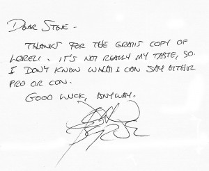
In April 1993 StarWarp Concepts released Lorelei Vol. 1 #0, with art by David C. Matthews and a cover by Vampirella’s Louis Small Jr. The prologue to Lori’s origin story, it introduced an exotic dancer named Marlene, her grouchy strip-club boss Forry (based on a comics retailer whose shop I used to frequent), a grinning sociopath named Paul, and a mysterious man named Arioch (think Boris Karloff in his later years). It was more moody and character-driven than horrific—and Lorelei didn’t appear in it at all, beyond the cover—but I was so proud of producing my first full-sized self-published comic that I wanted to share it with people whose work I admired. I mailed out comp copies to a handful of pros, and the first response I got was this:

Dear Steve –
Thanks for the gratis copy of Lorelei. It’s not really my taste, so I don’t know what I can say either pro or con.
Good luck, anyway.
—John Byrne

That’s right, in 1993 I was bold enough to send a copy of Lorelei #0 to one of comics’ major players—the guy who, in the 1980s and ’90s, was one of the top-tier artists of the X-Men, the Fantastic Four, the Hulk, and Superman. I don’t remember how I got Byrne’s contact information, but I wasted no time in taking advantage of that knowledge. And I got a laugh from his note, even if he didn’t care for the work. (I used to joke with friends that I should have taken out a full-page advertisement in comic-industry magazines: “Lorelei. The series that leaves John Byrne at a loss for words.”)

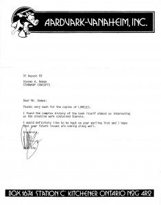
And he wasn’t the only one I heard from. That same year I also sent copies of Lorelei #0 and #1 to Dave Sim, creator/artist of Cerebus the Aardvark. I knew nothing of fear!  😉

I’d started reading Sim’s long-running blend of fantasy, politics, theology, drama, and satire a few months before I sat down to formulate my plans for the Lorelei comic. At that point, Sim was publishing the multipart “Jaka’s Story,” in which Cerebus was reunited with his lost love, a dancer in a tavern. I was so taken with Sim’s leisurely pace and character-driven plot (the arc ran for 23 issues) that I decided to apply that approach to Lorelei’s origin story: it was to run for twelve to fourteen issues. So who better to send the first two issues to than the man who inspired my crazy plan—and he liked them! Getting that letter definitely made my year.

Unfortunately, despite encouraging sales figures for the series—Lorelei #0 sold 2,500 copies, #1 sold 5,000—I eventually canceled the series with #5; it just wasn’t making enough money to support itself. Still, I was pleased with what I’d been able to accomplish in six issues—a lot of indie comics these days can’t sell 5,000 copies, and that number puts me above the sales figures for current mainstream comics like DC’s Batman Beyond Unlimited #1 (4,094), Archie’s Archie #632 (4,765), and Image’s Savage Dragon #179 (4,614). [Figures taken from ICV2’s “Top 300 Comics Actual: April 2012.] And mine was a black-and-white comic!

Tomorrow, I’ll show you responses from a couple of pros that really bowled me over, after I’d revived Lorelei for another go in 2002.

Posted in Comic Book Writing, Graphic Novels, Lorelei, On Writing | Tagged , , | 1 Comment

’Warp Artist Eliseu Gouveia Gets Much-Deserved Recognition

From May 10 to June 26 of this year, the city of Beja, Portugal, celebrated its eighth annual International Comics Festival—and ’Warp characters Pandora Zwieback and Lorelei both made appearances in an art gallery exhibition at the festival that celebrated the work of the incomparable Eliseu “Zeu” Gouveia!

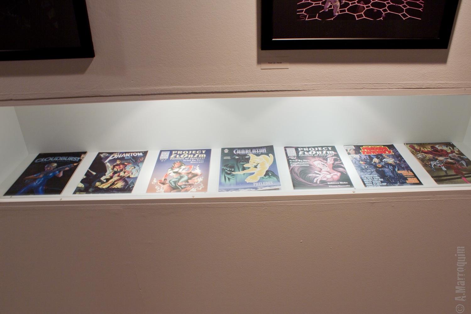
Around here you know him as the talented artist of the illustrated classics Carmilla and A Princess of Mars, the free comic book The Saga of Pandora Zwieback #0, and the forthcoming graphic novel Lorelei: Sects and the City, but Zeu’s been in the comics game longer than that—as you can see here:

From left to right: Image Comics’ graphic novel Cloudburst; Moonstone Comics’ The Phantom #26; Strange Matter’s Project ElOhIm #2; General Jinjur’s graphic novel Charlatan: Preludes; Project ElOhIm #3; SWC’s The Saga of Pandora Zwieback #0 (yay, Pan!); and Moonstone’s Infiniteens #2, a teen superhero adventure created, written, and drawn by Zeu. And that’s just a tiny portion of his artistic output!


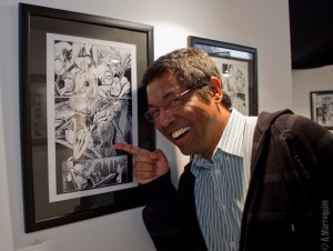
And here’s the man himself, proudly showing off a framed page from Lorelei: Sects and the City! Go ahead and embiggen the photo to get a good look. No, I’m not going to tell you what’s going on in that sequence—you’ll have to read the graphic novel to find out. I will say, though, that things don’t look good for our red-haired succubus…


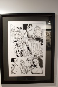
And hanging right beside that Sects sample was a page from Lorelei: Building the Perfect Beast, the in-the-works graphic novel that will explain Lori’s origin in full detail. What you see here is a scene focusing on Jasmine, Lori’s African-American roommate (and exotic dancer), who’s answering a casting call for a TV commercial. I think it’s pretty clear by now that Zeu really enjoys drawing beautiful women…  😀

Congratulations to Zeu on this milestone in his career—he certainly deserves the accolades. And thanks to photographer Amilcar “SuperMike” Marroquim for providing the photos!

Posted in Eliseu Gouveia | Tagged , , , , | Comments Off on ’Warp Artist Eliseu Gouveia Gets Much-Deserved Recognition

Gothic Beauties Love Carmilla

Well, this is great news: Gothic Beautythe magazine of Goth-inspired fashion and culture—has reviewed our first illustrated classic, J. Sheridan Le Fanu’s vampire novella Carmilla, in their latest issue (#36). Here’s part of what reviewer Gail Braise had to say:

“The character Carmilla is touted as the first lesbian vampire, and the way Le Fanu blends together desire and predation is spellbinding, even two hundred years after it first saw print. A true Gothic story, filled with dark, atmospheric ruins, high emotion, and blood-drinking revenants, shadowy histrionics, and set in a mysterious, exotic location, Carmilla is great fun.”

You can read the entire review—as well as articles on the latest fashions and an interview with artist Roman Dirge (Lenore)—by picking up a copy of Gothic Beauty #36 at most magazine retailers, or by ordering it through the Gothic Beauty Web site.

Carmilla—which features illustrations by Pandora Zwieback and Lorelei: Sects and the City artist Eliseu Gouveia—is available for order through brick-and-mortar bookstores, as well as from such online retail sites as Amazon.com and Barnes & Noble—or you can purchase a copy directly from the StarWarp Concepts webstore. Find out for yourself what makes gothic beauties so enthusiastic about this classic tale!

Posted in Carmilla, Gothic | Tagged , , | Comments Off on Gothic Beauties Love Carmilla

Convention News

Sorry, ’Warp fans in the Midwest, but due to unexpected circumstances I had to cancel my plans to attend this month’s Fright Night Horror Weekend and Film Festival in Louisville, Kentucky. But don’t worry, I’ve already put in a request for a booth at next year’s show, which is scheduled for July 26–28.

This means the next stop on the ’Warp’s 2012 convention tour will be September’s Baltimore Comic Con. That’s where you’ll find me—as well as my buddy, author Richard C. White—manning the SWC table in artists alley. For more information on the show, just click on the link in the Events sidebar.

Hope to see you there!

Posted in Comic Con, Events | Tagged , , | Comments Off on Convention News

Writing for Comics

“How do you write your comics?” is a question I get every now and then from convention attendees, usually young writers looking for the right format in which to express their ideas. It’s also a topic discussed among established writers when they get together.

It really depends on the individual. The independent market has a fairly loose approach. Image’s Todd McFarlane once stated during the early days of writing and drawing his series Spawn that his method was to have an idea for a story, draw the issue, and then arrange the pages in the order he thought worked best. (Then again, he was essentially writing for himself, without the input of an editor, so he could do that.) My friend J. D. Calderon—author of the fantasy novel series The Oswald Chronicles and the anthropomorphic epic-fantasy comic series Tall Tails—generally writes his scripts in short story/novella format and gives his artists the freedom to pace the comic version as they see fit.

In mainstream comics, there are two styles: full scripting, and what’s known as “the Marvel Method.”

Full scripting is exactly what it sounds like: the writer provides everything for the artist to work from—dialogue, character descriptions, settings, sometimes even camera angles. It’s similar to writing a movie screenplay, only the end result will be static images on paper instead of action on a screen. The scripts of Alan Moore (Swamp Thing, The League of Extraordinary Gentlemen, V for Vendetta) are known for being massive tomes—even the short ones. For example…

(Hope you’ll excuse all the capitalized words—Moore isn’t Internet-screaming, he just writes his descriptions with the cap-lock on.)
PAGE 1
(PANEL) 1.
WELL, I’VE CHECKED THE LANDING GEAR, FASTENED MY SEATBELT, SWALLOWED MY CIGAR IN A SINGLE GULP AND GROUND MY SCOTCH AND SODA OUT IN THE ASHTRAY PROVIDED, SO I SUPPOSE WE’RE ALL SET FOR TAKE OFF. BEFORE WE GO SCREECHING OFF INTO THOSE ANGRY CREATIVE SKIES FROM WHICH WE MAY BOTH WELL RETURN AS BLACKENED CINDERS, I SUPPOSE A FEW PRELIMINARY NOTES ARE IN ORDER, SO SIT BACK WHILE I RUN THROUGH THEM WITH ACCOMPANYING HAND MOVEMENTS FROM OUT CHARMING STEWARDESS IN THE CENTRE AISLE.

FIRSTLY, SINCE I’M NOT ENTIRELY SURE HOW THESE GRAPHIC NOVELS ARE SET OUT, MIGHT I SUGGEST THAT IF THERE ARE END-PAPERS OF ANY KIND THEY MIGHT BE DESIGNED SO AS TO FLOW INTO AND OUT OF THE FIRST AND LAST PANELS OF THE STORY. SINCE BOTH THE FIRST AND LAST PANELS CONTAIN A SIMPLE CLOSE-UP IMAGE OF THE SURFACE OF A PUDDLE RIPPLED BY RAIN, THEN MAYBE A SIMPLE ENLARGEMENT OF A BLACK AND WHITE RIPPLE EFFECT TO THE POINT WHERE IT BECOMES HUGE AND ABSTRACT WOULD BE IN ORDER? AS WITH ALL MY VISUAL SUGGESTIONS, BOTH HERE AND IN THE PANEL DESCRIPTIONS BELOW, PLEASE DON’T FEEL BOUND IN BY THEM IN ANYWAY. THEY’RE ONLY MEANT AS WORKABLE SUGGESTIONS, SO IF YOU CAN SEE A BETTER SET OF PICTURES THAN I CAN (WHICH I’D SAY IS QUITE LIKELY, ALL THINGS CONSIDERED) THEN PLEASE FEEL FREE TO THROW OUT WHAT I’VE COME UP WITH AND SUBSTITUTE WHATEVER YOU FEEL LIKE.

I WANT YOU TO FEEL AS COMFORTABLE AND UNRESTRICTED AS POSSIBLE DURING THE SEVERAL MONTHS OF YOUR BITTERLY BRIEF MORTAL LIFESPAN THAT YOU’LL SPEND WORKING ON THIS JOB, SO JUST LAY BACK AND MELLOW OUT. TAKE YOUR SHOES AND SOCKS OFF. FIDDLE AROUND INBETWEEN YOUR TOES. NOBODY CARES. ANOTHER GENERAL NOTE WOULD REGARD STYLE AND PRESENTATION. I’VE ALREADY GONE INTO THIS IN THE SYNOPSIS, SO I WON’T DWELL ON IT TOO MUCH HERE, EXCEPT TO UNDERLINE A COUPLE OF THE MORE IMPORTANT POINTS, ONE SUCH POINT WOULD BE OUR TREATMENT OF THE BATMAN AND HIS MYTHOS, INCLUDING THE BATMOBILE, THE BATCAVE AND WHATEVER OTHER ELEMENTS MIGHT FIND THEMSELVES INCLUDED IN THE STORY BEFORE IT’S END. AS I SEE IT, THIS STORY ISN’T SET IN ANY SPECIFIC TIME PERIOD. WE DIDN’T SHOW ANY CALENDARS, OR ANY NEWSPAPERS WITH HEADLINES CLOSE ENOUGH TO READ THE DATE. THE ARCHITECTURE AND THE SETTINGS IN GENERAL THAT WE SEE ARE EITHER OBVIOUSLY OLD AND DATES, AS IN THE CARNIVAL SEQUENCES, OR HAVE AN AMBIGUOUS ORT OF LOOK TO THEM THAT’S BOTH FUTURISTIC AND ANTIQUE AT THE SAME TIME, AS WITH THE FLEISCHER-SUPERMAN/LANG’S METROPOLIS LOOK THAT I SEE OUR VERSION OF GOTHAM CITY AS HAVING, AT LEAST ON IT’S UPPER LEVELS. THE LOWER AND SEEDIER LEVELS OF GOTHAM ARE MORE INCLINED TOWARDS A TERRITORY SOMEWHERE BETWEEN DAVID LYNCH AND THE CABINET OF DR. CALIGARI, ALL PATCHES OF RUST AND MOULD AND HISSING STEAM AND DAMP, GLISTENING ALLEYWAYS. I IMAGINE THIS STRIP AS HAVING AN OPPRESSIVELY DARK FILM NOIR FEEL TO IT, WITH A LOT OF UNPLEASANTLY TANGIBLE TEXTURES, SUCH AS YOU HABITUALLY RENDER SO DELIGHTFULLY, TO GIVE THE WHOLE THING A REALLY INTENSE FEELING OF PALPABLE UNEASE AND CRAZYNESS. SINCE I KNOW THAT YOU LIKE USING LARGE AREAS OF BLACK ANYWAY, THEN MIGHT I SUGGEST THAT WE USE THE DARK AND SHADOWY NATURE OF OUR BACKDROPS AND THE BLACKNESS OF THE BATMAN’S COSTUME TO GIVE US AS MANY INTERESTING PRIMARILY-BLACK COMPOSITIONS AS WE CAN GET AWAY WITH? THE FACT THAT THE JOKER IS SUCH A BLEACHED AND BLOODLESS WHITE PLAYS OFF INTERESTINGLY AGAINST THIS, I RECKON, SO PLEASE FEEL FREE TO GO COMPLETELY LOOPY WITH THE QUINK ON THIS ONE. AS FAR AS THE CHARACTERS THEMSELVES GO, I’LL DESCRIBE THEM IN DETAIL WHEN THEY MAKE THEIR APPEARANCES, BUT MY ONLY GENERAL NOTE WOULD BE THAT LIKE THE LANDSCAPE AND THE VARIOUS PROPS, THEY HAVE A SORT OF TIMELESS AND MYTHIC QUALITY TO THEM WHICH DOESN’T FIX THEM FIRMLY IN ANY ONE AGE-RANGE OR TIME-PERIOD. THE JOKER LOOKS EITHER OLD OR BADLY DEPRAVED, BUT THEN HE’S ALWAYS LOOKED THAT WAY. THE BATMAN IS BIG AND GRIM AND OLDER THAN WE ARE, BECAUSE AS I REMEMBER THE BATMAN HE’S ALWAYS BEEN BIGGER AND OLDER THAN I AM AND I’LL FIGHT ANY MAN THAT SAYS DIFFERENT. GIVEN THIS TIMELESS AND MYTHIC QUALITY, IT ALSO STRIKES ME THAT THERE ARE CERTAIN ELEMENTS OF THIS STORY THAT HAVE STRONG OPERATIC ELEMENTS. BOTH THE BATMAN AND THE JOKER HAVE A POWERFUL OPERATIC QUALITY TO THEIR APPEARANCE IN THAT THE JOKER IS AN EXTREME VERSION OF THE HARLEQUIN FIGURE WITH THE BATMAN’S CAPE AND MASK LOOKING LIKE SOMETHING STRAIGHT OUT OF DIE FLEDERMAUS. I DUNNO WHY I MENTION THIS EXCEPT TO UNDERLINE THE SORT OF GRAND EMOTIONAL INTENSITY I WANT THIS BOOK TO HAVE WITH BOTH THE BATMAN AND THE JOKER BECOMING POWERFUL AND PRECISE SYMBOLIC FIGURES IN A NIGHTMARISH AND ALMOST ABSTRACT LANDSCAPE. ANYWAY, BEFORE I WANDER OFF INTO A COMPLETELY IMPENETRABLE AESTHETIC FOG I SUPPOSE WE OUT TO ROLL OUR SLEEVES UP AND GET STRAIGHT DOWN TO BUSINESS WITHOUT FURTHER ADO.

THIS FIRST PAGE AND A COUPLE OF THE SUBSEQUENT ONES HAVE NINE PANELS APIECE, ALBEIT WITH VERY LITTLE OR NO DIALOGUE TO CLUTTER THEM UP. I WANT THE SILENCE AND THE METRONOME-LIKE VISUAL BEAT THAT THE PANELS WILL HAVE TO CREATE A SENSE OF TENSION AND INTRIGUE AND SUSPENSE WITH WHICH TO DRAG THE READER INTO THE STORY, WHILE STILL LEAVING US ENOUGH ROOM TO SET UP ALL THE NARRATIVE AND ATMOSPHERIC ELEMENTS THAT WE WANT TO ESTABLISH.

IN THIS FIRST PANEL, WE HAVE A TIGHT CLOSE UP OF THE SURFACE OF A PUDDLE. (SEE? AND THERE WAS YOU ALL WORRIED THAT I WOULDN’T GIVE YOU ANYTHING FASCINATING TO DRAW.) WE ARE SO CLOSE TO THE PUDDLE AS TO SEE IT ONLY AS AN ALMOST ABSTRACT IMAGE OF WIDENING RIPPLES SPREADING ACROSS A SHADOWY AND BLACK LIQUID SURFACE. IT IS NIGHT TIME, AND THE RIPPLES THAT WE SEE IN THE FOREGROUND ARE CAUSED BY LARGE DROPLETS OF RAIN THAT FALL THROUGH THE FOREGROUND IN DIAGONAL SLASHES. MAYBE WE CAN SEE ONE DROPLET AS ITS PRECISE MOMENT OF IMPACT WITH THE PUDDLE, SO CLOSE ARE WE TO IT. ALTHOUGH I DON’T SUPPOSE THAT THIS INFORMATION WILL MAKE MUCH DIFFERENCE TO THIS CURRENT PANEL, FOR YOUR FUTURE REFERENCE IT IS MID NOVEMBER AND BITTERLY COLD. HERE, ALL WE SEE IS THE RAIN SPLASHING INTO THE PUDDLE AND THE SILVERY WHITE RIPPLES SPREADING OUT ACROSS THE DARKNESS.
No Dialogue.

*  *  *

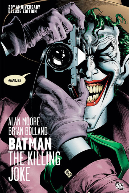
That’s the opening of Moore’s script for one of his most famous works, the graphic novel Batman: The Killing Joke. And that’s just his introduction and description for Page 1, Panel 1; the script for the first twelve pages of the book runs 39 pages! (script sample courtesy of The Comic Book Script Archive.)
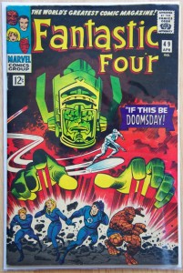
On the opposite end of the spectrum, the Marvel Method is similar to J. D.’s approach, only slightly tighter: The writer—with the guidance of an editor—breaks the plot into a page-by-page description, one paragraph for each page. That’s passed along to the pencil artist, who decides how best to visually present the story and sets the pacing. When the pencils have been completed, the writer then comes back to script the dialogue. It’s how Stan Lee and artists like Jack Kirby and Steve Ditko were able to churn out so many comics in Marvel’s early days. (It’s also how one of Kirby’s most famous co-creations, the Silver Surfer, came about. For a Fantastic Four story he thought a giant alien like Galactus—who was coming to eat the Earth—needed a herald/advance scout to let everyone know they were doooomed, and added a shiny metal guy riding a surfboard who wasn’t in the plot. Lee just went with it.)

It doesn’t work for everyone, though. After trying it one time, writer John Rozum (Xombi, Static Shock) blogged about the disadvantages of using the Marvel Method:

What happens, and this is by no means the fault of the artist, is that the story comes back looking fantastic until you sit down to the dialogue for the art. Expressions and body language are wrong for supporting the proper feelings being conveyed in dialogue, characters are on the wrong side of panels (or even missing) disrupting the flow of speech between them, the panel that requires the greatest amount of text will be the smallest on the page, as often ends up happening to the panel which should be the largest and most dramatic. Important props end up missing, etc.

Now me, I’m a full-scripting advocate. I love setting the scene and exploring the inner workings of characters to help the artist I’m working with better understand the people they’re drawing. (I’m also something of a control freak.) And if you hop over to the Pandora Zwieback site I’ll show you how I applied full scripting to a Pan comic book project I’m sure you’re all familiar with by now.

That’s right—you’re experiencing StarWarp Concept’s first crossover event. Take that, Avengers vs. X-Men!  😀

(Batman: The Killing Joke script sample © DC Comics.)
Posted in Comic Book Writing, Graphic Novels, On Writing, Scripting | Tagged , , , , | 1 Comment

John Carter and the Princess of Mars

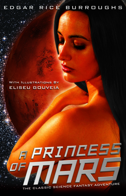
It’s DVDuesday, as they say on G4-TV’s Attack of the Show! Today is the release date for Disney’s John Carter, the movie adaptation of Edgar Rice Burroughs’s science fantasy novel, A Princess of Mars. But don’t just run out and buy the movie—do yourself a favor and pick up a copy of The ’Warp’s special edition of Burroughs’s action-packed tale.

A Princess of Mars features six incredible black-and-white illustrations by artist Eliseu Gouveia (Carmilla, Lorelei: Sects and the City, The Saga of Pandora Zwieback #0) and an introduction by science fiction expert John Gosling.

As for the movie…

It was a $250-million epic that had the power of Disney behind it, a New York Times bestselling author as one of its screenwriters, and the director of Pixar’s mega-successful Finding Nemo and Wall-E at the helm in his first live-action feature. So how could it turn out to be such a turkey at the box office that it got its ass kicked by the Dr. Seuss animated feature The Lorax—in that movie’s second week of release—and then by the Jonah Hill comedy 21 Jump Street the week after that?

Well, terrible marketing decisions were the biggest factor. Dropping the book’s title for the stunningly generic John Carter; director Andrew Stanton’s head-scratching logic was that no boy would go see a movie called A Princess of Mars, and no girl would see a movie called John Carter of Mars. (The title of this post came from a fan on an Internet forum who’d smartly suggested that Disney should have split the difference and called it John Carter and the Princess of Mars, thus giving it an Indiana Jones feel.) Trailers that told you nothing about the story or its setting—apparently after the failure of the animated feature Mars Needs Moms, Disney felt that Mars was a “bad” word to include in a title, so no mention was ever made of the planet that Carter is transported to. Failing to educate the general public that the movie was based on a novel published in 1912, or that the book was written by the creator of Tarzan of the Apes, Burroughs’s most famous character.

It took the fans at the John Carter Files Web site, using all the footage that was available online, to accomplish what Disney’s marketing department seemed incapable of doing: create the kind of trailer that would make John Carter look interesting, and let people unfamiliar with the 100-year-old novel know that Carter’s adventures predated—and inspired—movies like Avatar and Star Wars: Attack of the Clones (both of which the uninformed public loudly complained were being ripped off by Carter):

Looks interesting, doesn’t it? Well, if you’d like to read the source material on which the movie was based, A Princess of Mars is still available for order from brick-and-mortar stores, as well as from retailers like Amazon and Barnes & Noble. Or you can buy it directly from the StarWarp Concepts store.

And librarians: As with our YA dark fantasy Blood Feud: The Saga of Pandora Zwieback, Book 1 and our other illustrated classic, Carmilla, A Princess of Mars is distributed by Ingram Book Group, available at a standard discount. If you have an account with Ingram, contact your representative and tell them you want to add StarWarp Concepts titles to your library!

Posted in Princess of Mars | Tagged , , , , | Comments Off on John Carter and the Princess of Mars

Hunting for Snow White

Today is the big-screen debut of the epic fantasy Snow White and the Huntsman, starring Charlize Theron (Prometheus), Kristen Stewart (Twilight), and Chris Hemsworth (The Avengers). There’s been a lot of positive buzz about the film, which (very) loosely adapts “Snow White,” the Brothers Grimm’s classic fairy tale that celebrates its 200th Anniversary this year.
So before you line up at the box office this weekend (or even while you’re standing on line), there’s no better time to become reacquainted with this timeless story than by reading StarWarp Concepts’ first e-book-only release!

Snow White features five incredible full-color illustrations originally published in 1883, and is available for just $1.99 from DriveThruFiction.com and the StarWarp Concepts store. Download your copy today and read it before the movie previews start!

Posted in Snow White | Tagged , , | Comments Off on Hunting for Snow White